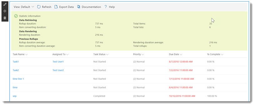
You will see four tabs on the left-hand side: Web Part, Data Source, Columns, and Display. The tabs are explained below:
Web Part
The Web Part tab is the initial tab where you can select the type of data that you will connect to and whether you want to display it as a Grid View or a Chart View.
Data Source Provider
The Web Part tab allows you to specify whether you will use a SharePoint List, Business Connectivity Services, oData Service, SQL Azure, Microsoft Excel, Microsoft Graph Connectors, or Current Paga Data Source in order to aggregate the content.
Display Provider
There are two choices from which to pick:
- Grid View – This provides a familiar table structure in the existing SharePoint page style.
- Chart View – This provides common, configurable charts which allow you to visualize your data.
Limit number of items
Choose the maximum number of items to be displayed. Choosing 0 or leaving empty will have no limit. Depending on the number of items, setting a limit can improve performance.
Data Refresh Interval
The Data Refreshing interval is set to the number of seconds an automatic refresh of the data will display. The default is zero, which means that the web part will not automatically refresh. Automatically refreshing is suited to a dynamic display of content such as Recent Announcements, and the requirement for Announcements to be automatically displayed as they happen perhaps on a communication site.
Data Source
The Data Source is where you will configure the connection to the data source provider. The page will vary depending on the data source provider you are connecting to. This section covers the different data source providers available in the web part.

SharePoint List


Business Connectivity Services
Business Connectivity Services (BCS), which was retired in Microsoft 365 on September 30th, 2024, by Microsoft (https://learn.microsoft.com/en-us/sharepoint/business-connectivity-services-retirement), is a set of features available to SharePoint allowing for External Line of Business data to be accessed through SharePoint. A good reference to BCS is available here: https://docs.microsoft.com/en-us/sharepoint/administration/business-connectivity-services-overview.
In the Data Source tab, enter the External Content Type Namespace and External Content Type Name and check availability. As in the SharePoint List data source provider above, configure the columns and display as desired.
OData Service
Some Data Sources are available to connect to through a RESTful service such as OData. OData also makes it possible to connect to On-Premises data sources, even if your SharePoint Tenant is in the cloud. On the web part tab, under Data Source Provider, select OData Service.
- Leave the default values for the Display Provider, Limit Number of Items, and Data Refresh Interval.
- On the Data Source Tab, copy and paste the following service URL into the OData Service URL field. https://services.odata.org/V3/Northwind/Northwind.svc/
- Click Load Entities to retrieve the list of Tables.
- Select “Suppliers” from the list of available entities.
- Click the Columns tab, and select all of the columns by clicking the column selector above the column names as shown below:
- On the Display Tab, you’ll see that you can apply data formatting, column alignment, grouping, colours and formatting. Note that clicking the ellipses next to the columns will bring further attributes. You can also refine options at the bottom of the dialog such as pagination, column header display. Turn on Allow Selecting Rows and then choose Save.
- You will now see you data returned from the OData Service. Next, we will add another instance of the web part.
- Add Another instance of the Data Viewer by clicking the + and choosing Data Viewer as shown below.
- On the Web Part Tab, select OData Service again as the Data Source.
- On the Data Source Tab, paste the same OData Service URL as you did in Step 5, and click Load Entities.
- Select Products.
- On the columns tab, select all columns.
- Click the Filter Icon for the SupplierID column.
- Click the connect icon as shown below to obtain the filter value from the first Data Viewer instance.
- Select Lightning Data Viewer as the Data Source, Selected Items, and SupplierID as shown below.
- Click Save.
- On the Display Tab, set the Unit Price format to currency
- Click Save.
- Test your connection by selecting a supplier from the Suppliers Data Viewer instance. You should then see the products that the selected suppliers supply.
- Next, we will add some conditional formatting and data bards to the Products list.
- Within the Products list, select the dropdown on the Units in Stock column and choose Column Settings, Formatting.
- Click the trash can icon to remove the condition on the conditional formatting dialog.
- Click Data bar, and set the maximum value to 150.
- Set the Show Value to hide Value as shown below.
- Click Save.
- Click the drop-down for the Discontinued column, and choose Column Settings, Formatting.
- Set the condition to be Discontinued = False
- Add a new conditional style, and set the condition to be Discontinued = True.
- As shown below, select a red icon for the first condition and a green icon for the second condition.
The Conditional Formatting will now be applied to the Products list so that you can clearly see the products are are discontinued.
SQL Azure
If you have a Microsoft SQL Server database that is hosted within Azure, you can connect to it using the Data Viewer. Any SQL Azure database can be connected to, and you can display results from it. As with the other data sources, you can highlight key business information and configure the Data Formatting.
On the Data Source tab, enter the server details and click Load Entities. Afterwards, select the database/tables and views.

As with the previously mentioned data sources, choose the required columns and display settings as needed.
Microsoft Excel
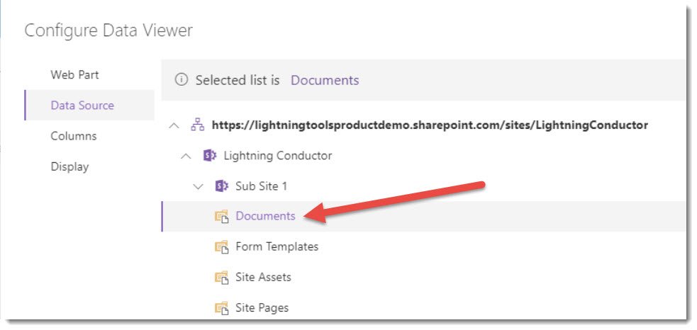
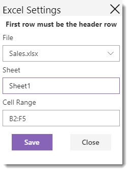
When choosing Microsoft Excel, the Data Source tab provides a list of SharePoint sites from which to locate the Library containing the Excel workbook. Selecting the Library prompts an Excel Settings dialog from which to select the Excel file, Sheet, and Cell Range.
In this walkthrough, we’ll create a simple Excel Workbook within the SharePoint site document library and then configure a dynamic chart based on it.
- Navigate to the Document Library within the current site that you are working in.
- Create a New Excel Document within the Excel workbook.
- Create the following Excel content
- Highlight your range of data, and choose Format as Table.
- Ensure that “My table has headers” is checked and click ok.
- Ensure your Excel workbook is saved in the Document library.
- Add a new instance of the Data Viewer to your SharePoint page.
- Click Configure to launch the configuration dialog.
- In the Data Source Provider field, select Microsoft Excel.
- In the Display Provider field, select Charts view.
- On the Data Source tab, expand the current site and then documents and select the document library containing the Excel Workbook you created.
- You will be prompted to select an Excel workbook, a sheet, and a range. The range will be detected automatically.
- Select all four columns; Month, Sales Revenue, Cost of Sales, and Profit.
- Click the Display Tab.
- You will see a chart based on your data.
- Click the Cog icon next to Sales Revenue.
- Choose Column as the Category Type, and select Theme Color for the colour of the columns.
- Click Save
- Click the Cog Icon next to Cost of Sales and change the colour to bright green.
- Click the Cog icon next to Profit, and change the category type to area, and the colour to turquoise.
- Click Save to complete your chart.
Microsoft Graph Connectors
This feature requires prior configuration of Microsoft Copilot Connectors (formerly called Graph Connectors), which allow a user to pull data from external cloud-based (SaaS) data sources and on-premises data stores. See Microsoft Copilot Connectors for details. After that configuration, select the source connector and configure the columns and display tabs as desired, like with the previously mentioned data sources.

Current Page Data Source
This data source allows you to connect to Lightning Tools web parts on the current page (like the Lightning Conductor or another Data Viewer) and display info from those web parts. For this illustration, there are two Data Viewer web parts on a page.


Select Data Viewer 1 from the dropdown.


Select Retrieved Items and save, and then choose the columns and desired display settings.


After saving the web part configuration, notice that Data Viewer 2 now has the same info as Data Viewer 1 since Data Viewer 1 was the current page data source.
If Selected Items was chosen instead of Retrieved Items in the aforementioned step, only selected items in Data Viewer 1 will be displayed in Data Viewer 2.
A further demonstration of Current Page Data Source can be seen here.
Columns
The Columns tab enables you to define which columns will be displayed within your grid or chart view. Each column that you wish to display can be selected by clicking the mouse on the column name. You can set the column order by dragging and dropping the required column up or down. The topmost column on the columns tab will be the leftmost column within your configured view.
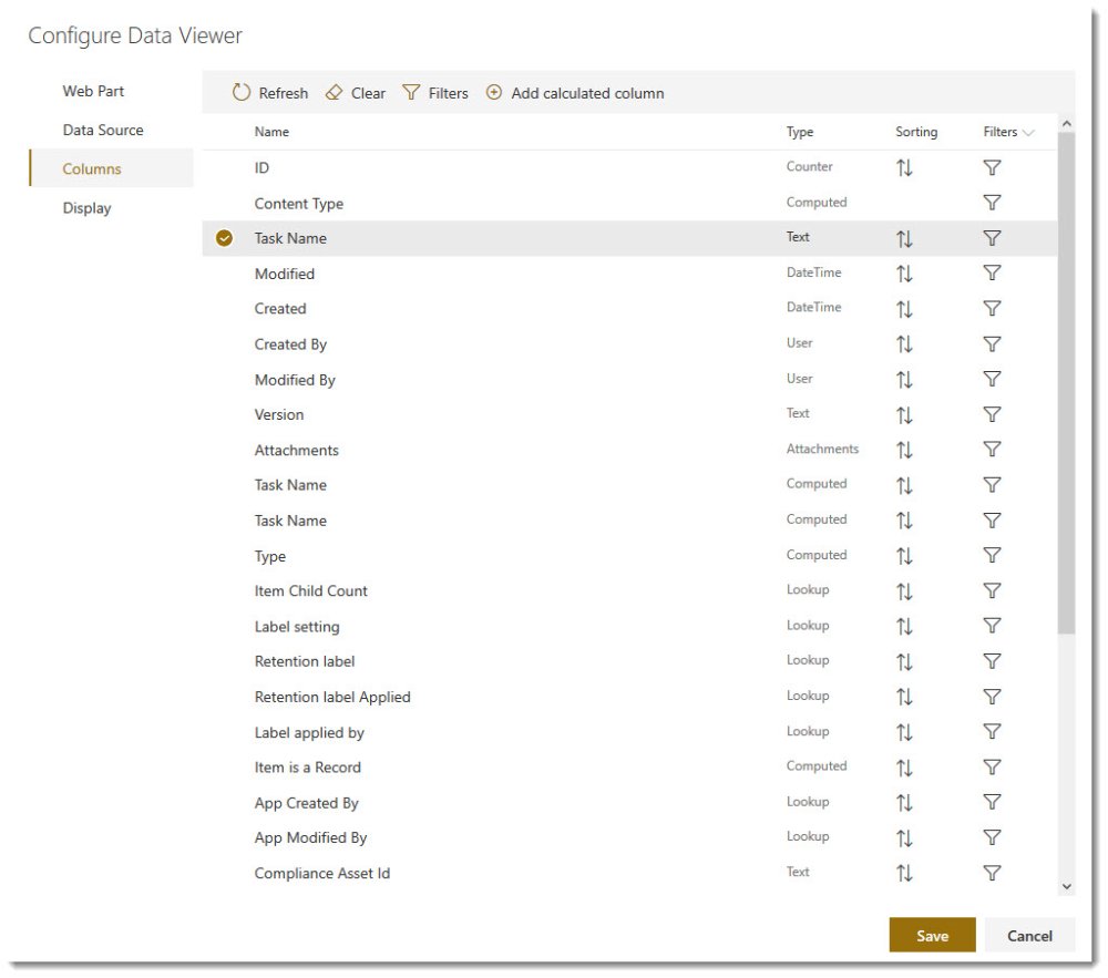
*If you have changed the Data Source or List Type, you should click the Refresh button to update the available columns. You can also clear your selection by using the Clear button.
The Filters button allows you to specify advanced filters that span multiple columns.
Add Calculated Column enables you to create a new column containing a calculation.
To add a calculated column, select the link from the top toolbar to open the Configure Calculated Column dialog window.
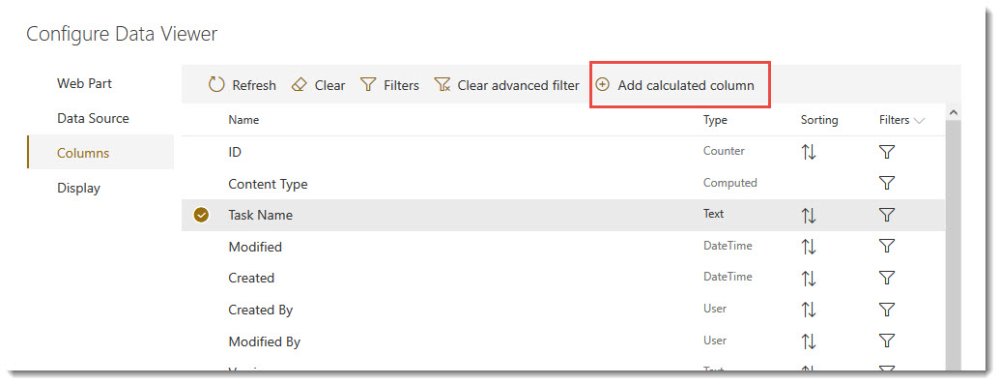
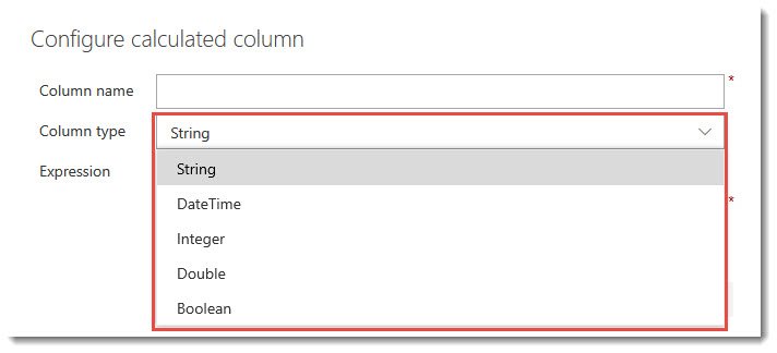
Once the dialog window appears, the following fields are required.
- Column Name – This will be the name of the new calculated column
- Column Type – Use the drop down to select the field type (e.g. String, DateTime, Integer, etc)
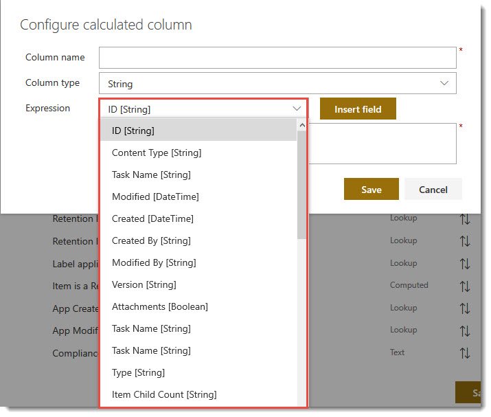
- Expression – To build an expression, select the field from the drop down box and then select Insert Field. Build the expression as required, and then click Save.
Sorting
Column sorting can be specified as Ascending (A-Z) or Descending (Z-A) by clicking the Sorting Icon ![]() next to each field. Clicking once will sort Ascending, while clicking twice will change it to Descending.
next to each field. Clicking once will sort Ascending, while clicking twice will change it to Descending.

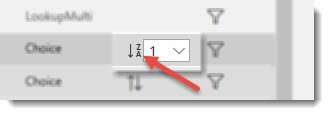
When sorting by multiple fields, use the drop box next to the Sorting icon to specify the Primary, Secondary, Tertiary sort order, where 1 is the highest priority.

You can also turn off sorting for the column by deselecting the Sorting icon.
Filters
Persistent Filters can be set on the columns tab against each column by clicking on the Filter icon ![]() on the right for the field on which the filter will be applied. Filters can be configured on each column, whether displayed or not. Each column type can also provide different filtering options, for example, a Task Due Date field (e.g. Date/Time field) filter allows you to filter by tasks due [TODAY],
on the right for the field on which the filter will be applied. Filters can be configured on each column, whether displayed or not. Each column type can also provide different filtering options, for example, a Task Due Date field (e.g. Date/Time field) filter allows you to filter by tasks due [TODAY],

and an Assigned To column allows you to filter by tasks assigned to [Me], and so on.

Display
The Display tab allows you to refine the display, such as data formatting, colour formatting, pagination options, or configure the display of your chart.
Grid View
When the Grid view is selected on the Web Part tab, you will see options on the Display tab specifically for configuring the grid. The Grid View will display your aggregated list items within a table (grid view). You can use the Display tab to modify the display (view) using the settings listed below.
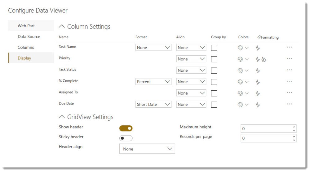
Column Settings
- Format – The Display Format will change the way in which the data for that column is displayed. For example, you can change the Display of a Date to Short Date or Long Data, and a Numerical column to Currency, Percentage etc.
- Align – This allows you to align the field content to the left, right, or center of the column.
- Group By – Check the Group By check box if you would like to group by a column, such as Priority. You can group by as many columns as you like. You may also set the primary and secondary grouping by changing the number in the group by using the drop down box if more than one column is selected.
- Colors – Selecting this option allows you to choose a Font color or Background color for the field.
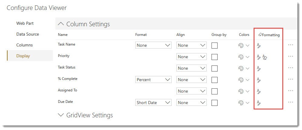
- Formatting – The formatting option allows you to specify formatting with or without a condition. Conditional Formatting is a method for changing the styling of data when a certain condition is met. For example, you may want to display overdue tasks in red so that they are more visible to users.
To apply formatting, select the ![]() icon on the right side under the Formatting column for the relevant field. This will display a dialog box for configuring condtional formatting.
icon on the right side under the Formatting column for the relevant field. This will display a dialog box for configuring condtional formatting.
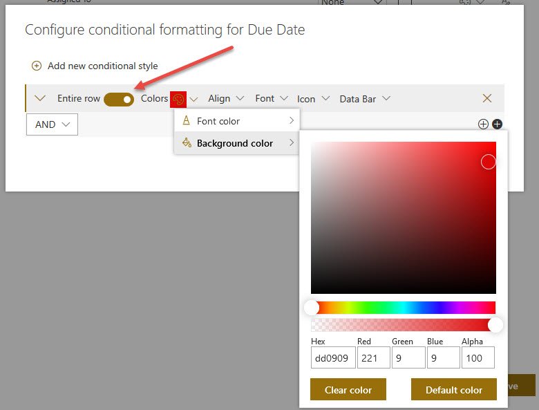
Conditional Formatting can be applied to a cell value or to an entire row of data.

- Entire Row – Apply formatting to the entire row or just the column value (By default, your formatting is set to the column value only.)
- Color – Foreground Color and Background Color (Select a color or enter the RGB code)
- Align – Set the alignment None (default), Left, Center, Right.
- Font – Select Bold, Italic, Underline checkboxes.
- Icon – Select an icon to display in the cell next to the data.
- Data Bar -
To add a condition, select the white plus icon ![]() . For example, if you want all overdue tasks to appear in red, you can change the background color of the Due Date field to red and add a condition where Due Date >= Today, as shown below. Also, by clicking the slider option for Entire Row will apply the style to the entire row and not just the column/field of the relevant condition.
. For example, if you want all overdue tasks to appear in red, you can change the background color of the Due Date field to red and add a condition where Due Date >= Today, as shown below. Also, by clicking the slider option for Entire Row will apply the style to the entire row and not just the column/field of the relevant condition.
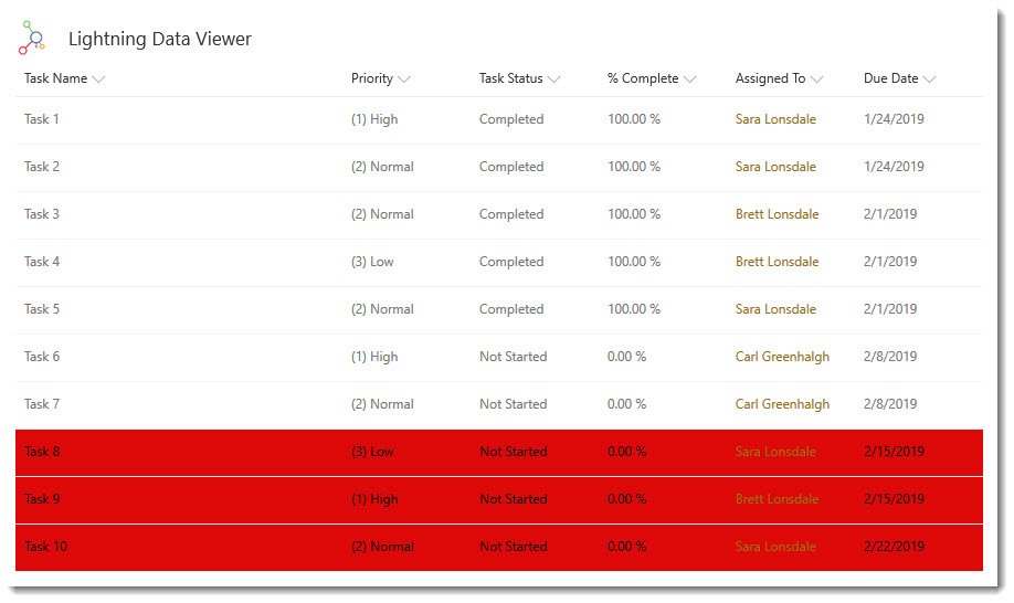
Clicking the black plus icon ![]() will add an additional condition for the same conditional style.
will add an additional condition for the same conditional style.
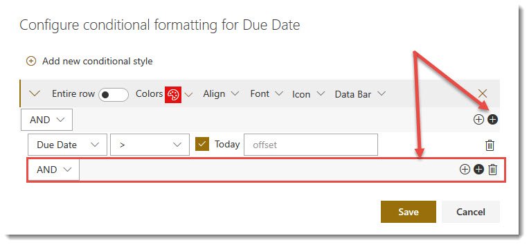
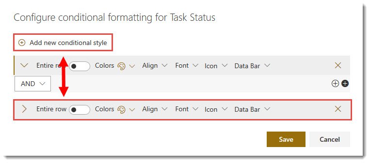
To add more conditional formatting on the same field, select Add new conditional style. This will allow different style settings based on a new condition for the same field.
Other settings upon clicking the (…) ellipses icon include:
- Alias – Most column names are not user friendly. In the Alias text box, type an alternate name for the column name.
- Font decoration – Allows you to modify the cell font to Bold, Italic, Underline, Strikethrough, or Overline.
- Show – Show or hide column values. When you use the Group By check box for a column, you many not wish to display the column as values from the column are they are displayed in the group heading.
- Allow HTML – For columns such as Rich Text columns that contain elements of code. You can select whether the code is rendered or the markup is displayed.
- Multiline - For multiline columns, text can be fully displayed by selecting this option.
- Custom Formatting - JSON custom formatting can be applied to a Data Viewer grid view column as you would to a default SharePoint list column. As in this Microsoft article (https://learn.microsoft.com/en-gb/sharepoint/dev/declarative-customization/column-formatting), you can enter the column formatting JSON into the Data Viewer custom formatting box, and the changes will be reflected in the grid view.
Grid View Settings
- Show Header – Show or hide the header (columns headings)
- Sticky Header – Keep the header displayed whilst scrolling through the list items.
- Header Align – Align the column labels: Left, Center, or Right.
- Maximum Height – Set the maximum height for the rows in pixels. Empty is dynamic height to fit the content.
- Records per page – How many results per page do you want to display.
Chart View
When the Chart view is selected on the Web Part tab, you will see options on the Display tab specifically for configuring a chart. The Chart View will allow you to visualize your aggregated data in a chart style of your choice.
On the Display Tab, you will be able to configure the following:
- Chart Type – This is a choice between Combo, (Line, Column, Area, Scatter), Pie & Donut, Gauge, TreeMap, and GeoMap.
- Chart Settings – These will be different depending on the Chart Type selected.
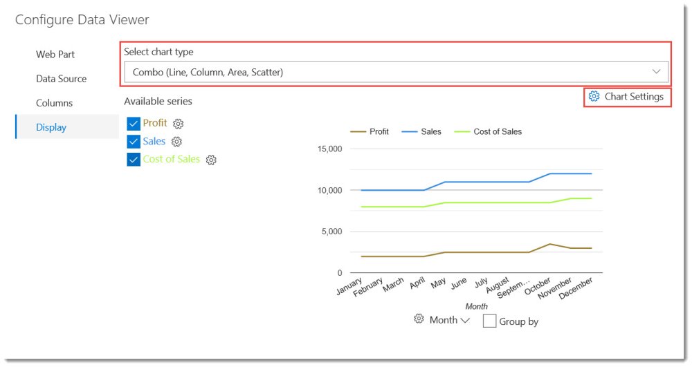
*To configure your data to be displayed as a chart, select Chart View on the Web Part tab first.
Configuring a Combo (Line, Column, Area, Scatter) Chart
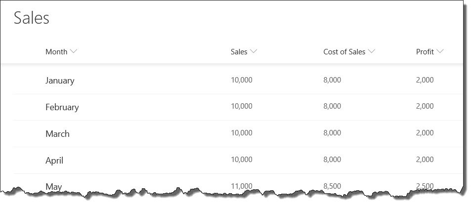
In the example configuration below, we are using a SharePoint List as our Data Source Provider, with the Data Source set to a Sales List, containing the following columns: Month, Sales, Cost of Sales, Profit. The columns can be selected on the Columns tab.
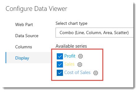
Available Series
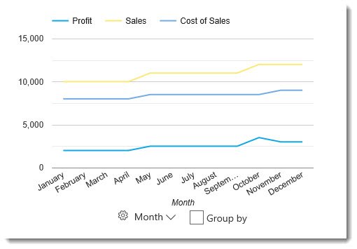
On the Display tab, we will first choose the Combo chart type. We are then shown the Available Series, which includes the columns selected on the previous tab. Our example includes Profit, Sales, and Cost of Sales. Only the first column is selected by default, but we can check whichever columns we want to be included in our chart. In this case, we will want to include all data columns to see how they change each month, so we have checked each box. The chart has already determined that the Month column (not visible in image below), which was selected on the Columns tab, will be the X axis in the chart, where Profit, Sales, and Cost of Sales can be plotted for each month.
Once the columns have been selected, you will see them appear in the graph as lines.
Each item in the Available Series can be configured separately by clicking on the cog ![]() icon next the the column name. For example, you may want to change the color of the line, or choose to display the data as an area instead of a line. Clicking on the cog wheel will provide the following options when using the Combo chart.
icon next the the column name. For example, you may want to change the color of the line, or choose to display the data as an area instead of a line. Clicking on the cog wheel will provide the following options when using the Combo chart.
-
Category Type – Choose between Line, Column, Area, Scatter.
-
Color – This is the color of the line, column, area or scatter points.
-
Curve line – If the Category Type is set to Line, you can choose to have a sharp line (default) or curved line.
-
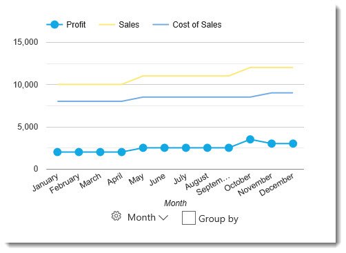
Point Size – Each data point that is plotted on the chart has a dot, which when viewing as a Line, does not appear by default, as the dots are the same size as the default line width. Changing the point size higher will show the exact point that is plotted along the line. When choosing Scatter category type, you will only see the data points with no line. Point Size can be used with Line, Area, or Scatter. For example, the image below shows Profit as a Line category type, with Point Size set to 10.
-
Point Shape – The shape of the data point can be set to either Circle (default), Triangle, Square, Diamond, Star, or Polygon. Point Shape can be used with Line, Area, and Scatter, and will appear as long as the Point Size is higher than zero.
-
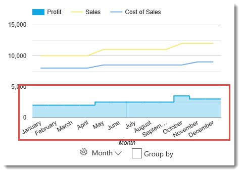
Is stepped – Only shows when Area is selected for the category type. Changes in Y axis data is stepped vertically, and there are no diagonal lines.
-
Trendline – A trendline is a line superimposed on a chart revealing the overall direction of the data. It can be visible only on continuous and numeric horizontal axis. By default, this is not enabled. By enabling this setting, more specific options will appear below.
-
Trendline Type – Linear or Exponential. Linear uses straight lines, while exponential uses curved lines.
-
Trendline Color – Change the color of the trendline. By default, this is set to the theme color, but can be configured to No color, or Custom color. Then the color can be either selected on a color picker, or defined in Hexidecimal or RGBA.
-
Trendline Width – Set the width of the trendline.
-
Trendline Opacity – The transparency level of the trendline
-
Trendline Type – Linear or Exponential. Linear uses straight lines, while exponential uses curved lines.
Horizontal (X) Axis Settings
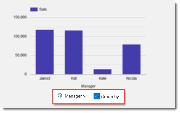
While still on the Display tab, below the graph, you will notice three options related to the horizontal (X) axis: horizontal settings ![]() , a column drop down menu, and an option to Group By the selected column.
, a column drop down menu, and an option to Group By the selected column.
-
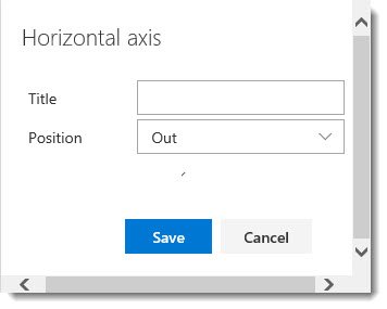
Horizontal Axis Settings
-
Title – Define a title for the horizontal axis, or leave blank to use the column title.
-
Position – This is the position of the labels. None (no label), In (Displays in the graph), or Out (Default, displays below the X axis)
-
Title – Define a title for the horizontal axis, or leave blank to use the column title.
-
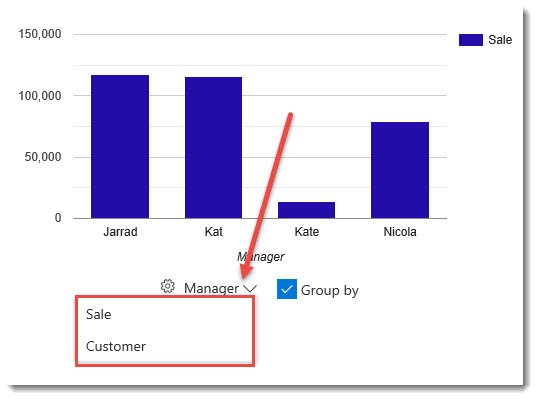
Column Drop-Down Menu – Choose the column to be displayed along the X-Axis
-
Group By – If applicable, you can group by data within the selected column. When Grouped By is selected, you will notice that in the available series list, a drop-down menu will appear for each column, allowing you to select an aggregate function. For example, you may want to display the total number of sales invoices (Count), as opposed to the total amount of sales revenue (Sum).
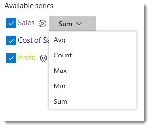
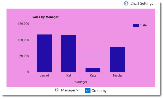
The example below shows the Sales Revenue by Manager, which is displayed by selecting the Sum aggregate function for the Sale column and checking the box to Group By Manager. This data is being retrieved from a list which includes the columns Sale, Manager, Customer, and Invoice Date.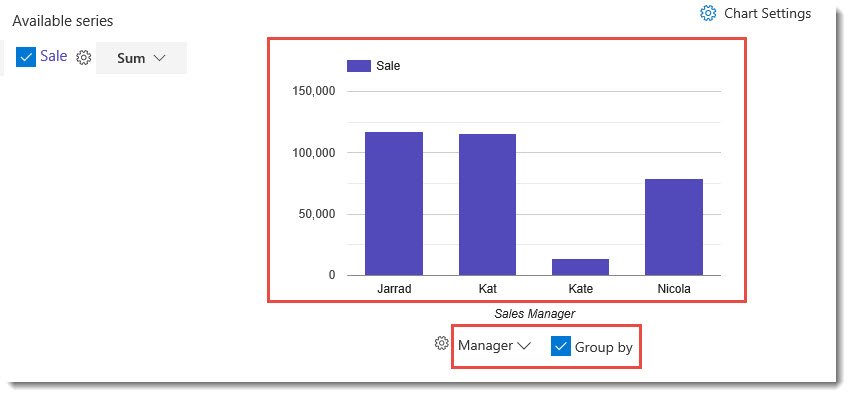
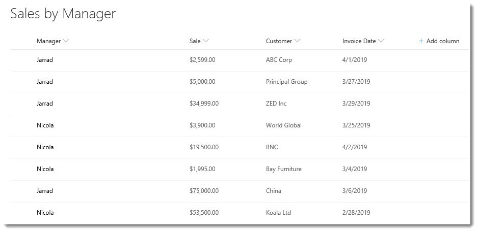
Chart Settings
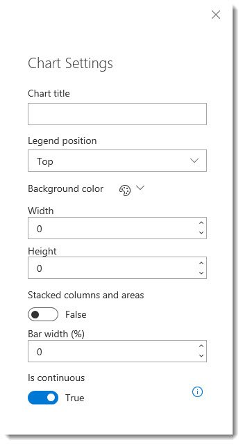
Additional settings for the Combo Chart can be found by clicking on the Chart Settings ![]() icon.
icon.
![]()
-
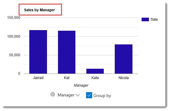
Chart Title – Add a title at the top of the chart
-
Legend Position – Top (Default), Right, Bottom, Left, In, Labeled
-
Background Color – No Color is the default. Can alternatively choose the Theme color, or select a Custom color for the background of the chart.
-
Width – Define the width of the chart
-
Height – Define the height of the chart
-
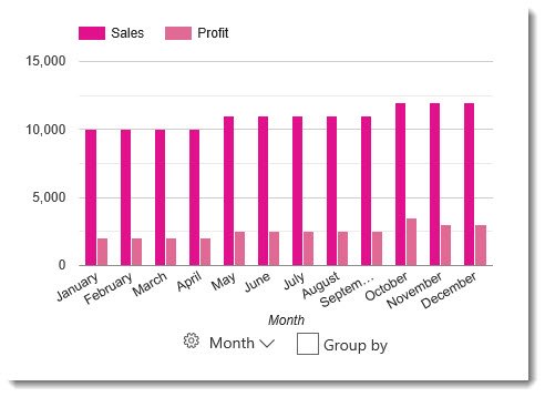
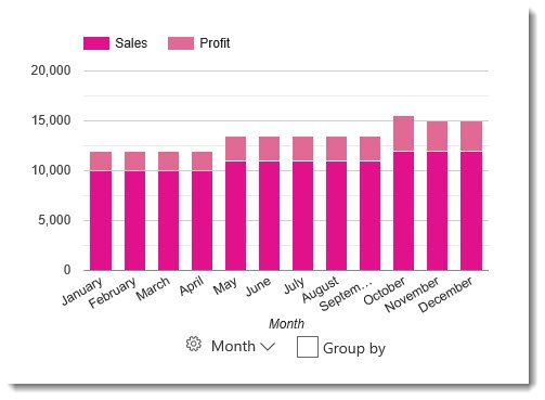
Stacked columns and areas – True or False (Default). If your chart contains multiple series with at least one as a Column (bar) and one as Area, this setting affects how the columns and area are displayed. When True, the columns and areas will be displayed on top of each other. The images below show a chart displaying two columns, the first image of the default False setting, while the second shows the setting set to True, or stacked.
-
Bar width (%) – When the column chart type is selected, this defines the width of the bars.
- Is Continuous – True (Default) or False
Configuring a Pie & Donut Chart
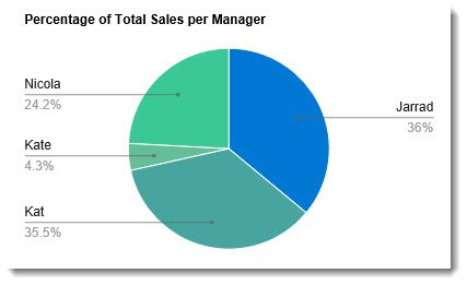
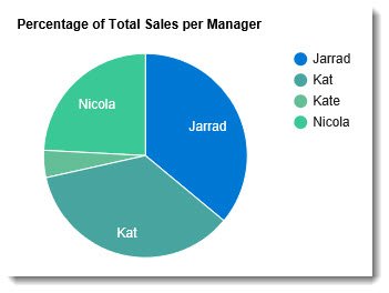
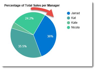
In the example configuration below, we are using a SharePoint List as our Data Source Provider, with the Data Source set to a Sales by Manager List, containing the following columns: Manager, Sales, Customer, Invoice Date. The columns can be selected on the Columns tab. In our example, we will display a Pie chart showing the total percentage of sales per manager.

Slices and Values
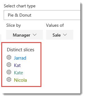
On the Display tab, select Pie & Donut from the drop down menu. We are then given two drop down menus for Slice by and Values of, which contain columns from our Data Source list. After selecting Manager for our Slice, we can then choose the Value for the slices, which in this case will have to be Sales.
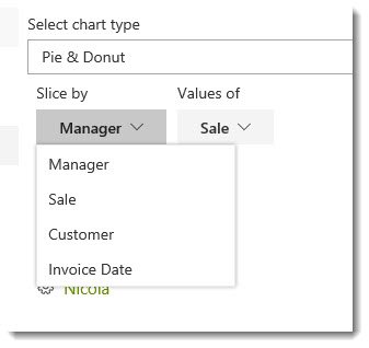
Below our Slice by and Values of drop down menus, you will see Distinct slices, which lists the fields that fall under the Manager column in the Data Source list. Each distinct slice has a settings cog ![]() , which allows you to modify the color of the slice, and whether the slice is offset from the rest of the pie.
, which allows you to modify the color of the slice, and whether the slice is offset from the rest of the pie.
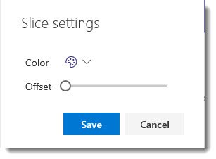
If you choose to offset any slice, move the sliding bar to the preferred offset position. The further right you move the bar, the further the slice will move away from the center of the pie.
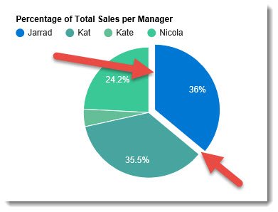
Additional Pie Settings
By the Pie, you will see a Group by checkbox.
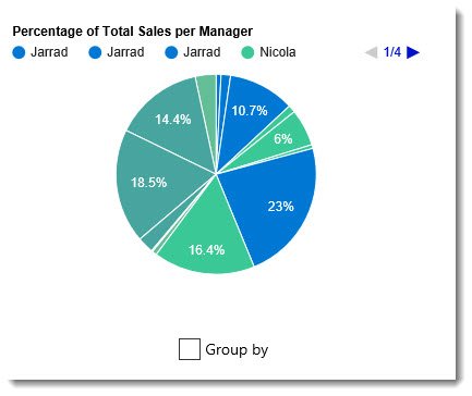
In our example, we will want to consolidate the slices by checking this box, which will reduce the number of slices by allowing us to aggregate the sales into one slice per manager.
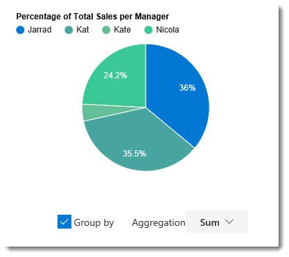
When Group by is selected, you can choose the aggregate function type via the Aggregation drop down box. In our example, we want to aggregate by the Sum.
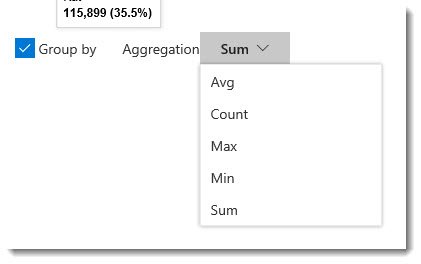
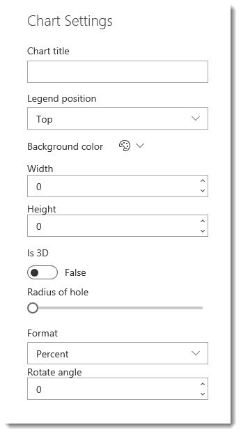
Chart Settings
-
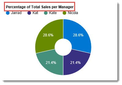
Title – Similar to the Combo chart, you can add a title to your Pie Chart
-
Legend position – Top (Default), Right, Bottom, Left, In, Labeled (Shown below)
-
Background color – No Color is the default. You can alternatively choose the Theme colour or select a Custom colour for the chart's background.
-
Width – Define the width of the chart
-
Height – Define the height of the chart
-
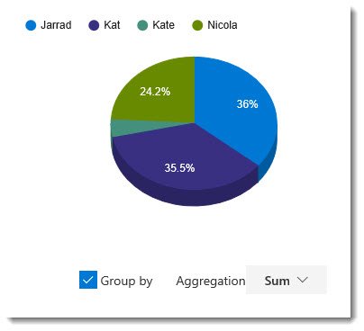
Is 3D – True/False switch to make the chart display in 3D. The default setting is False. The image below shows the True setting.
-
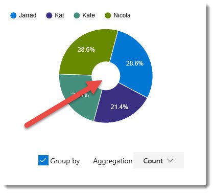
Radius of hole – This is a slide bar that allows you to create a Donut chart. Sliding the bar to the right creates a hole, which gets larger the further the slider is moved to the right.
-
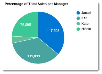
Format – This menu allows you to choose what format the value of the slice will take.
-
Percent – Sets the slice value to a percentage.

-
Value – This displays the exact value calculated from the list. In our example, Sales will display as the total dollar amount.
-
Slice label – The slices will be labelled with the distinct slice names.
-
None – No label on the slice.
-
Percent – Sets the slice value to a percentage.
-
Rotate angle – Default is 0. Any integer greater than 0 will rotate the chart to the degree entered.
Configuring a TreeMap Chart:
See https://help.lightningtools.com/lightning-data-viewer/displaying-a-treemap-with-the-data-viewer
Configuring a Gauge Chart:
See https://help.lightningtools.com/lightning-data-viewer/building-gauges-with-the-data-viewer
Configuring Map/GeoMap Charts:
See Lightning Tools Data Viewer for SharePoint and Teams - Webinar Recording. Note that a Google Maps API key is needed to use the Maps chart feature.
